Pin It

Wednesday, June 30, 2010

Studio Sketches Wednesday Sketch Challenge

I just love this weeks Sketch Challenge. The panels were very fun to work with. I spent a lot of time deciding what I was going to use for the focal point of my card. I started out with the "Studio Sketches" but then I set it aside. I then took out "Hello Again, "Pocket Silhouettes" to be used along with "Oval All" and "Friends 24-7". As I looked at each one I kept leaning towards the "Studio Sketches" and obviously that's the one I ran with.

I knew what colors I wanted to play with. I just LOVE the new Cherry Cobbler, it's SO rich looking. I was going to use the Daffodil Delight for the panel #2 but once I got the piece cut and set in place it was a bit too bright. And after realizing that the pears were going to be green, I thought I'd better go with a green. I opted for Garden Green. I used it in the pears too but use a blender pen to wash out the color a bit more. They are not exactly the colors of pears but that is what I ended up with so I left it. Same with the pitcher. I am not thrilled with how dark it came out. I used the Cherry Cobbler marker only. I think I may have been happier with it had I used the Cherry Cobbler color with a blender pen.
I did get to play with the Smooch Spray. I sprayed it on the #1, #2 and #1 panels. Plus I sprayed it on my ke
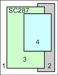
y board, mouse and worktable. I swear I looked at the nozzle before I went to spray!!! It was easy enough to clean up but cleaning up wasn't on my agenda. I just wanted to stamp. But I had to stop and clean because I didn't want that mess on my cards or the side of my hands, oh and fingertips from my keyboard!!! And yes, I did spray into the new "Color Catcher". It's designed to place your work inside and spray away with no mess. Just make sure you aim your sprayers right!!! LOL I am SO loving those Smooch Sprays and I can't wait to have the gals play with them when they come to stamp next month!! They're just TOO fun!
Ok, back to my card and me! It's all about "me" you know!!! On the #3 panel I used the Smooch Spray on the Cherry Cobbler card stock. The Smooch Spray does moisten your card stock so while it was still moist I covered it with clear embossing powder and heat set it. I like the texture it gave that panel. On panel #2 I just left it with the Smooch Spray only and same with the #1 background piece. I sponged the edges of some of the panels with Chocolate Chip.

I had the card all put together and was about to take the photo of it when it caught my eye that on the left side of the #3 panel there was a lot of empty looking space. What to do??? I lifted the panel off the background piece without ripping it. Then I slid the foamy mat pad under it and punched holes in it for brads. I used black brads but brown would have been nicer since the base of the card is the new Early Espresso card stock. But no one will notice if I don't tell them!!! LOL
I do like the card, except for the darkness of the pitcher. I especially like the Sketch and plan to use it on some other cards I need to make. I need to make a masculine card. I think I'll try to make this sketch work with it. It's for my nephew's birthday (on the 26th - I'm late with it!!!).
If you have time play with this sketch. It's something you can work with for your Christmas cards. Yup, it's time to start thinking about what you are going to make this year for your Christmas cards. Get them started early so you aren't rushing at the last minute to get them done. I love to start mine in September. I get them all stamped and I get one made up. Then I cut all the parts and pack them up in a box to take with me when we go up to Duluth for a few days in the fall. I am fortunate that I can work on things in the car. I get a lot of stuff done that really hate to sit and do at home. I have a great set-up in the car. I'll have to have hubby take a picture of it this fall. It's kind of comical too. But it's what I like to do and it doesn't bug him while he drives so it's all ok! I promise I'll have him take a picture then you'll know what I'm talking about.

Thank you SO much for visiting today,
Wanda

Tuesday, June 29, 2010

Friends Never Fade

This is one of the cards from the DIVA Day event and Shoe Box Swap on Sunday. I don't know who made this card. We forgot that part of the swap!! So, whoever made this card, thank you. It was a very fun card to make. It is a nice clean layout and the colors are fabulous.

The decorative paper is from the new "Greenhouse Gala" package. I wasn't going to put this on my wish list but.....
And the image used here is from the new "Friends Never Fade" set. Again something that wasn't going on my wish list but now it is!!! UGH!!!
The Chocolate Chip background was dry embossed using the Dotted Swiss embossing folder. It adds a nice touch to that background.
The image was stamped, then cut by hand around the edges and then layered on top of a piece of the new Pear Pizazz card stock. It was set on the card with Dimensionals with the ribbon running under it. Such a pretty touch.
And I really like this layout too. It can be used for a lot of the smaller images. It's always good to find layouts that will help you use those smaller stamps without them getting lost on the card stock.
It was a quick card to do but I must keep in mind that all of the card stock was cut out for me. But even with that in mind I think it would be a very quick card from start to finish.
Isn't it just a FABULOUS card?
Thank you for visiting today,
Wanda

Monday, June 28, 2010

Decor Elements Wall Art

A while back when I was at my friend Denise's home she had this Decor Element on a frame on a wall in her bathroom. I just loved the way it looked. You could see the wall behind it. Well, when I bought my frame I wasn't thinking about the wall behind the glass. I got the words on and I held it up and I could see all the little staple prong things that hold the glass in place. UGH!! SO I thought I'd better come up with a Plan B. I dug out a bunch of decorative papers and started looking through them. I ended up using the stripped paper from the "Bride" package. I just LOVE that paper. And once I got it put in place and got it all together I liked it even more. That bride paper went so well with the wallpaper I have.

After I finished it I had to hang it up. SO I'm taking things off the walls trying to find a place for it in my workroom. It now has a home and I'm thrilled to have it on the wall.

The last time I did one of these rub-ons on glass I got it crooked. SO this time I used a permanent marker on the glass and marked the spots where the words are to line up. I also went online and found some free graph paper. I downloaded it, printed one out and taped that to the glass too so I had no excuse for crooked words!! They look pretty straight, don't they? And don't you just LOVE that background paper? It looks SO much better in person. If you click on the photo you can see a closer view of it and you'll see the decorative paper better too.

I saw the new Decor Elements and there is one I think I'm going to HAVE to get for my wall in the hallway. They are SO easy to put up and look FABULOUS on the wall. You never have to worry about them getting crooked once they are up like frames sometimes do. No edges to dust or polish either!! My kind of wall art!! They are fun and easy to put up too! And it also makes a wonderful gift too!
Thank you SO much for visiting today,
Wanda

Sunday, June 27, 2010

Baby Bundle Pink and Blue Cards

These are the cards I made for the Shoe Box Swap I participated in today. I just LOVE those kind of swaps. You get to make cards but everything is all cut for you!!! And it's always fun to see what the other gals have come up with too!

For my card I used the "Baby Bundle" set. I made two cards, one in pink and one in blue. I was going to make them all pink because I was using the Pirouette Pink card stock but I thought I could work a new blue into the layout and I used a returning color Baja Blue.

On the pink card, Pretty in Pink was the color of the bottom layer and on the blue card Bashful Blue is the color on the top layer.

I also got to play with the little button die cut. It's one that I do like but I forget I have it. This little die is a Sizzlet and it has 4 different buttons on it. Just TOO cute. So on my card I cut out two buttons. One in the light color and one in the darker color. I took the lighter color buttons and cout the outer edge off. It's easy to see and do because it's kind of perforated. Then I sponged the edges with the lighter color of ink. I glued the center piece on and then tied a piece of hemp cord on. I wanted to use linen but I didn't have any. I do have some, I just don't know where it is. It wasn't in the place where I usually keep it.
I also LOVE the "Lattice" die. Another die I like but don't use often enough.
And for some final touches I added some brads to the top part of the baby buggy (or is it a pram? Is there a difference?) and I added brads to the wheels. Just something to give the card a bit more dimension and texture. I think they turned out cute. I don't know why I chose to make a baby card. I don't need any right now. I do need a birthday shower card so I guess I should get on the ball and get that made soon. I don't want to fall too far behind on my card making.
Thank you SO much for visiting today,
Wanda

Saturday, June 26, 2010

Just Buzzin' By Flowers Card

Here is the last bee card I made using the "Just Buzzin' By" set. This card went home with Sharon last week. It was fun playing with her stamp set. Now I know how the gals feel when they come here to stamp using my new sets!!! It's a lot of fun!!
I had some fun Dotted Swiss decorative paper that I used for the background.

The center piece was dry embossed with the Dotted Swiss embossing folder.
What was really fun about this card was that after stamping the flowers I just used a square punch to punch them out. Gotta LOVE that. It makes doing the flowers SO much easier. And the scalloped layer behind it is a punch too! Talk about simple!!! I LOVE simple cards!
Now as I'm looking at this card and thinking that there is something wrong with it I finally saw it. It's the first flower. I didn't put it on straight. the stem should be at the bottom, not the side! Sharon, if you read this post remove that first flower and turn it so the stem is at the bottom. I must have been so excited to get it done that I didn't pay attention to that little detail!!
Now to explain further about the "easy" part. I just colored in the flower with a marker and then colored over a few areas of the flower with the same marker, it just made that area look darker. It was nice to be able to do that with just one marker and no blender pen! Simple, simple, simple!!!!
This just made a fun and bright and cheery birthday card. A versatile set for sure!!!
Thank you SO much for visiting today,
Wanda

Friday, June 25, 2010

Studio Sketches Friendship Card

I'm not really sure why I bought this set. It's not really my style. Maybe on the day I was placing my order something sparked my interest in it. What happened was I probably saw a sample done with one image and was hooked!!! Silly me. SO I figured since I had the set I might as well put it together and play with it. And this is what I came up with.

I took the "En Francias" background stamp and stamped it on Whisper White card stock using VersaMark ink. I embossed it with white embossing powder.

Next I took 3 sponges and sponged on some Pacific Point, Elegant Eggplant and Certainly Celery ink. Start out with the Certainly Celery then add some Pacific Point and finally fill in the open areas with Elegant Eggplant.
Then I used the new Smooch spray. I used "Log Cabin" and "Vanilla Shimmer." I set it aside to dry. When it was time to use it I did take a paper towel and blotted the piece. I thought some of the Smooch spray may be beading up on the embossing. I wasn't sure if it would dry on the embossing or not. I'm not really sure if it does. What was on the embossed areas did blot up and what didn't easily rubbed off. I do like the effect it has on my card. I should have Smooched the image and word but I didn't. It may be too muted to see the image. I'll have to play with those Smooches more! They are fun. Everyone LOVES Smooches!!! LOL If you click on the photo you can see bits of splatter and some sparkle from the Smooches.
The words came from the "Oval All" set. A must have for me. There are 4 wonderful and extremely useful images in it. I think I have used them all many times.
I tied a piece of Elegant Eggplant around the card and tied a piece of ribbon on top. It really was a quick and simple card to make.

There's three more images in this set and I'm going to challenge myself to use them all! Though I may surf the net for some samples to get me inspired!

I thank you SO much for visiting today,
Wanda

Thursday, June 24, 2010

Just Buzzin' By Card

Here is another card I made using the "Just Buzzin' By" stamp set. Aren't those little bees just adorable? I found this image at SplitCoastStampers, it was made by TBevier (that is her user name on SplitCoast).

When I saw this card I thought it was just too adorable not to copy. SO I downloaded the photo and saved it for a later date!
Once again I used the "Brayered Bubbles technique here. It's a very fun technique and extremely easy to do too! I think it would be fun to color on the bubbles with different color markers to give it a whole new look!
This card was very fun to CASE (copy). Now I didn't copy this card exactly. The original one has a different background than the Brayered Bubbles and the bottom not only has a ribbon but wording too and a different color of paper at the bottom too. I like both cards!
And like the last "Just Buzzin' By" card I made this one when home with Sharon too! She's such a sweetie!
Thank you for visiting today,
Wanda


Wednesday, June 23, 2010

Watercolor Trio Wednesday Sketch Challenge

I think I may have used this "Watercolor Trio" set on last weeks Sketch Challenge! I guess that must mean that I REALLY like the set!!! I do love this little flower from the set!

I have several techniques going in this card. On the main piece (#1) I used my scoring tool and made some lines across the bottom (three of them) and one across the top. They don't show up well in the photo but trust me, they are there.

The #3 layer is done using the "non-metallic Polished Stone" technique. I used the new Cherry Cobbler color too! It's SO pretty.

And the final technique I have on here is "Direct to Rubber". I colored with the markers directly on the rubber. I huffed on the image when I was done and then stamped it.

I added three black brads to the right on that #2 panel. It just needed something there. I kept the sketch pretty simple. I just liked the layout a lot and didn't want to add or take away anything from it. I could have added soem ribbon at the bottom but I liked the clean look of the embossed lines.
It was a very fun sketch and if you have time play with it. This sketch has smaller pieces to it and it will let you use some of those smaller scrap pieces of decorative paper you've been hoarding!!! Raise your hand if you hoard your decorative paper. Did you actually raise your hand??? LOL
I can see myself using this layout for other cards. I have a lot of images that would fit in the #4 piece. And I have LOTS of scrap pieces of decorative paper!!

Thank you SO much for visiting today,
Wanda

Tuesday, June 22, 2010

Just Buzzin' By Flower Card

I get all done making this card, so I thought. I take the photo for the blog and I get it all set up to enter it in and I'm thinking to myself, "what is wrong with this card?" I knew there was something missing but I just couldn't put my finger on it. I'm putting away the ink pad and other items I used to create this card and there it is, the missing item. It's the vase! It was all colored and ready to go. Go where? DUH!! So I take the card and actually finish it. I'm showing you both so you can see how easy it is to miss something like that. Actually I like them both but the vase sure does add a lot, doesn't it?
I used the "Perfect Plum" designer series paper along with a piece of Perfect Plum card stock and black card stock. The image was stamped on white card stock using black StazOn ink. The words were done on the computer.
This was actually a very simple and quick card to make.

The cute vase is made using the honey pot in the "Just Buzzin' By" stamp set. You take a marker and color over the part of the image you want to stamp. The drip of honey wasn't something I wanted on the vase and maybe if I were using a different flower it may have hid the honey drip and the image could have been stamped as is. And the best thing about this is the flower came with the "Just Buzzin' By" set!!! Thus making the set more versatile and you know how much I LOVE it when I get a set that is versatile!!!
This is a fun set and Sharon was such a sweetie to leave it with me to play with. All the cards I made with it I sent home with her!
Thank you SO much for visiting today,
Wanda

Monday, June 21, 2010

Butterfly Punch Magic!

Ok, so it's not magic but it is unique. I made this card at Sue's a few weeks back. It's a fun way to make the pansy too. You just punch out two butterflies and color them like the flower is colored. I didn't do a good job coloring my flowers. I have seen some that REALLY look like a pansy is right on the card. But I did finish my card and that says a lot right there!!! Sometimes when I take things home with me to work on they rarely get finished. But I really wanted to try this butterfly flower thing and in the process I finished the card. I'm not sure if I would make any more cards like this though. I thought it was a lot of work to get those butterflies to look like a pansy.
I used the "Birthday Wishes" from the Sincere Salutations stamp set. One of my favorites!! The words were stamped on a piece of card stock that was dry embossed in the corner.
I used watercolor crayons to color the butterflies and an aqua painter. You start out with the center color and work your way out to the edges. Once they dry you will add the black lines with a marker. Then you will want to curl up the edges a bit. Layer two butterflies together and poke a hole in the middle. Add a brad and tape in place on your card. There's not a lot to it, it's just a matter of getting the colors on there right and getting them to bleed just enough. I used white card stock here. I did try it with watercolor paper and found it even more difficult to deal with. The watercolor paper holds the moisture a lot longer and I got too much bleeding going on. To the point to where the center of the flower was almost gone. I misted the butterfly and placed a paper towel over it to see if I could lift a bit of color off because it was way too dark. Misting watercolor paper like that and using the paper towel caused almost all the color to lift off. UGH! So back to the regular white card stock! I redid them as best as I could and called it a done deal!!!
In person it is a very pretty card!
Thank you SO much for visiting today,
Wanda

Sunday, June 20, 2010

Star Guitar Wall Decor

I finally got this guitar up on the wall. I have had it for a while and had good intentions of getting it up on the wall but something always came up. It went in hubby's office/music room. So if I wasn't busy and had time to put it up hubby was not home or didn't have time to clean off that counter. I didn't want to touch his stuff so we just had to wait for the right time. So it took almost 6 months!!!

When I saw this guitar in the "Definitely Decorative" brochure I knew it would look great on his one wall. He liked the idea of it but he didn't like the heart in the middle of the guitar. I told him I would cut that heart out into a circle and it would look just FABULOUS on the wall. It came with 8 musical notes too. One is hidden behind the guitar hubby is building. He's been working on it a very long time and it's slowly coming along. Inside the guitar is a margarine dish of some type. I keep asking him how he's going to get that out of there and all he tells me is that it's up to the instructor to do that!!! I'm assuming he really means he has no idea how to get it out of there and the guy teaching the class is going to have to help him with that. The handle part of the guitar is out in the garage. I think he's working on the frets for it. Then he'll be gluing that part in place. Then a finish is put on and finally, I think, the rest is adding the hardware and strings. I'm guessing there, I really have no idea. I just know he's been working on it about as long as I've had the wall art. Now that I'm done he should get busy and get his done!
I had him come down and see his wall and he really liked it. I knew he would! I just LOVE that Definitely Decorative "stuff." I got the new book in the mail a week or so ago and I have picked out a few that I am adding to my wish list. I have a wall in mind for one of them right now but I have to wait for a bit to see how bad I REALLY want it or if I just want to want it!
I have two more items that I bought and I need to work on them. One of them is the kitty from the "All in the Family" and I'm not sure what I'm going to do with it. I only bought it because it was a kitty. LOL I'm such a sucker for cat things like that. I may just put it on the bedroom door we keep our old cat Millie in. Oh, don't feel bad for her. I take her out of there when I need to vacuum the room. I don't want her to be in there when I vacuum. I don't want her to be scared. She goes out in the living room and hubby brushes her there while I vacuum. Boo loves to go in there and spend the night. I call it "girls night out!" And K.C. likes to go in there but he goes in there because he thinks the food is different so he has to go eat Millie's food too! Silly cats. SO at times all three of them are in there but usually there is two in there at a time. I open the door and one (that is allowed to) will leave and the other one will go running in. Cats are the craziest people! Anyway, the door may be a good place for that Decor Element! I may just go put it on there when I'm done with this post!
Thank you SO much for visiting today,
Wanda

Saturday, June 19, 2010

Trendy Trees Thank You

You are NOT going to believe this. I did not CASE this card from anyone. I didn't yesterday either! I must be slowly getting my mojo back. I didn't realize it was gone until I had taken some "mental" time off and CASEd a few cards. Nothing wrong with copying cards others make. That is how we learn and for some that is just how they stamp. As long as you give credit where credit is due it's all ok.
I LOVE the Stampin' Up! "Trendy Trees" set and don't play with it as much as I would like to. This card could use a bit more finesse to it but for now I'm just keeping it simple. I am aware that not everyone enjoys making cards with lots of layers. I LOVE layers but at times do need a break from them too!
The "thanks so much" is from the "Teeny Tiny Wishes" stamp set. A set I just LOVE using. It's got pretty much all the words you need and they all fit in the Word Window punch. I didn't use that punch here, I only layered the tree.
I did use a Stamp-a-ma-jig to line up the tree and the trunk. I stamped the trunk first and then the green. I used the oval punch and lined up the tree and punched it out. I used the scalloped oval punch for the layer behind it. I set the layers on top of the card stock and I could see how blah the card was. I decided to punch the corners but I didn't want to get too carried away, I wanted to keep it simple and after I punched the corners I saw that the "blah" I had before wasn't all that blah! I think I liked it better before the corners were punched! It's quick and simple to make, that's for sure!
Thank you SO much for visiting today,
Wanda

Friday, June 18, 2010

Beautiful Wings Sympathy Card

I LOVE this Stampin' Up! "Beautiful Wings" embosslet! Embosslets are fun because you not only get the image punched out but it also embosses it at the same time! I love the bit of flourish on the large butterfly's wing.

I also used the "Elegant Boutique" embossing folder for the white background piece. I did have a little problem making this card. First I did the white background piece. Then I stamped the words on and got them not only crooked but too far over. Then I took a piece of card stock and stamped the words where I thought they should got. I got them on nice and straight. I got interrupted and had set the card stock down somewhere and lost it! I have since cleaned up my stamping stuff for this card and that piece has not shown up. I wonder what happened to it? It may be hiding with the earring I lost a few days ago, though I am suspecting it may be one of the cats who has something to do with that. I suppose I could blame the cat for this too, I know it would make me feel better about it!!! LOL Anyway, I stamped another one and then embossed it. After I removed it from the embossing folder I could see how crooked the wording was. UGH! But I decided to just leave it as it is. I was too anxious to see the butterflies on the card. I can't even begin to tell you how many colors of card stock I went through before I found a color I liked. Too bad the Almost Amethyst is retiring. But there will be better and more fun colors to play with next month!!
This is a very simple and versatile card to make. It will work for a number of occasions like birthdays, wedding, anniversary, thinking of you, friendship, get well and yes, even a sympathy card. And it's quick to make too (if you don't want your words perfectly straight!!!).
Thank you SO much for visiting today,
Wanda

Thursday, June 17, 2010

Just Buzzin' By Card and Technique Page

Isn't this card adorable? Of course it is. It's another treasure I found while surfing the net. I actually found this gem at SplitCoastStampers. It was made by Julie deanat. I copied almost exactly as she made it except I moved the hive up and added the words under it. She has her hive centered in the square which is cute too but I wanted to add the words to the front. Adorable, isn't it?
Now for the technique. I have not done this technique in years. It's called "Bubbled Brayer." You just take bubble wrap and your brayer and brayer over the bubbled with your favorite color of ink. Here I used So Saffron. It gave it the look of a bee hive. Oh and when doing this technique you will be able to see which bubbles have been popped too! You will have blank open spaces on the card stock! I managed to work around them or under them! I think there is a blank one under the bee hive. No one will ever know now! I just thought it was an adorable card and a perfect way to display the technique!
Thank you SO much for visiting today,
Wanda

Wednesday, June 16, 2010

Watercolor Trio Wednesday Sketch Challenge

This is the card I made for this weeks Sketch Challenge over at SplitCoastStampers. I almost didn't do the sketch because I'm not a big fan of square cards. But I stuck with it and this is what I came up with.

The base of my card is Basic Black card stock. The dotted colored paper is from "The Write Stuff" decorative paper pack. There is a sliver of Rose Red card stock showing behind the flower image panel.

The image is from the Stampin' Up! "Watercolor Trio" set. I LOVE that set! The words are from the "Holiday Blitz" set. Such a fun set with LOTS of little stamps in it. It is retiring, which is too bad because I LOVE that set! And what was great about this is the words fit in the punches so I was able to just stamp, punch and tape! Gotta LOVE that!!!

I colored in my flower using markers. That technique is called Direct to Rubber. It's one I use a lot. It's nice that techniques don't retire!!

I tied a black grosgrain ribbon at the top of the card before I taped it all together.

I don't think I will be making any more of this sketch though I may try it on a regular size card. Maybe!!

If you have time try this out. Try it out on a regular size card and show me! Email me your card here.

Thank you SO much for visiting today,
Wanda


Tuesday, June 15, 2010

Bird on a Branch Anniversary Card

I saw this card on the Yahoo Demo's Only site. It was made by mickeyinpsj1956. There is no link I can set to show you her card but other than the color of ribbon and the words at the bottom it's exactly like her card. I thought it was a cute image and perfect for a needed anniversary card.

The technique used here is Brayering. You do need to do this on glossy card stock to get the full effect of the technique.

After I cut my glossy card stock I punched out a circle for the moon using a piece of sticky note paper. You want the circle to stick to the card stock but not forever. You can also use removable tape but I find it leaves little marks on my card stock when I am removing it. It's probably and ok thing for the moon but I don't care for that on my cards.

Ok, once you get the moon in place take your brayer and ink pad and cover the card stock. Make sure you go in all directions so you get an even color. I actually used two colors here. I first brayered on Pacific Point and then I sponged on Night of Navy. I started at the top with the Night of Navy and worked my way down. As I worked down the ink got less and less on the sponge and created that look of the top being darker than the bottom (because it is). I actually wanted it a bit darker and was going to pick up a little black and sponge it in but decided to leave it as it is. Take a paper towel and wipe the card stock off of any excess ink. Now you can remove the paper to reveal the moon. If you like the moon white you can leave it as it is. If you want to add a bit of color you can do it at any time. What I did was punched out another circle using a larger piece of scrap card stock. I placed it over the moon, lining up the edges and sponged in a bit of color. Simple as that.
I used black StazOn ink for the branch, birds and words.

I tied on the ribbon before I taped the card stock to the base of the card. The base of my card is Night of Navy. Isn't it a very pretty card? See why I just HAD to make one? I've been doing a bit of blog hopping lately and finding some GREAT treasures out there. I will be sharing my favorites as I find them. And of course giving credit where credit is due!
Thank you for visiting today,
Wanda

Monday, June 14, 2010

Sweetheart Ribbon Flower Card

I can't believe I almost forgot about this wonderful ribbon card that Denise helped me make. I wasn't going to make it but she offered to sew the ribbon for me. A few posts back on the FABULOUS Tuxedo masculine card I mentioned how much I LOVE to sew!!! My sewing machine rarely sees daylight anymore. I took it out earlier this year to sew some papers together and after cleaning it up and oiling all of it's parts it didn't sew how I wanted it to so I put it back, closed the cover and put my Fiskars paper cutter on top of it again!! That is mostly what it is good for now is my paper cutting station!!! SO Denise sewing the ribbon meant a LOT to me!!

For this card, after the ribbon is gathered, the thread is tied off and a corduroy brad was put in the center. The Stampin' Up! "Sweetheart" set was used for the stem. They were stamped using Old Olive ink.
If you click on the photo you will see to the right at the bottom is a label punched out waiting for verbiage. I didn't know what I wanted this card to say so I left it blank until I'm ready to use it. There is another option for words here and that is to remove that label and stamp the wording along the bottom. Either way will look GREAT!
What I also like about this card that Denise designed is that it's just a quarter sheet of card stock for the back. The front piece (Very Vanilla) is folded in half and the two layers and flower are placed on top of that.
This is such a quick card to do too, quicker if you can get someone to sew your ribbon!!! LOL This would make a great birthday, get well, thinking of you and thank you card. It's a very versatile design.

Isn't it just an adorable card? Thank you Denise, I LOVE it! And thanks again for sewing the ribbon for me. I'm SO spoiled!
Thank you for visiting today,
Wanda

Sunday, June 13, 2010

Star Punch Card

I saw this card at Michelle's blog Stampin’ With Michelle and I just had to make it. Mine is a little different than hers. She also did it in different colors. But the first one I saw was the green one and it stuck in my head so I went with it. I wished I would have thought it through more though. When I was all done with the cutting and punching and stamping and more punching I realized I didn't have any green ribbon to match. I had Certainly Celery and Old Olive but neither of them looked nice on the card. I actually thought about starting over (the perfectionist part of me showing here) but I changed my mind when I thought about using card stock at the bottom of the card instead of the ribbon. It's not as pretty as the ribbon but it worked out just fine. I was happy with the way the card turned out and it's not cpied exactly like Michelle's card, which is not a bad thing or a good thing. A touch of me on the card is ok too!!! Oh and I also added the colored star on the oval which is different than the original too!

The word stamp came from the "Curvy Verses" set. I just used my black marker and colored over that word only and stamped the image on the card stock and punched it out. Here's a tip on coloring words with markers to get them to come out nicely. I take my marker and on the side of it I tap on the words. Don't rub back and forth or even in one direction. That causes the ink to fill in on some of the letters, like the "o" and especially the "e". Tapping on it gets the ink on the rubber more evenly and not inside the letters. It does take a bit longer to tap but it's SO worth it!


I think it's a very cheery card and I do like the colors of green!


Thank you SO much for visiting today,
Wanda

Saturday, June 12, 2010

Elements of Style Thank You Card

I have been having some fun just making simple cards. Really! They are simple and with just a few layers too!

I saw a card that was similar to mine. It was made by Dacia at My Creative Days. I don't know how I happened to have stumbled on her blog but I did and I took a look around for a bit. This card stuck in my head. I liked how she did hers too but I wanted to change it a bit. Hers has a "B" in the middle of the stamped images. She used hers for graduation thank you cards. I liked how it looked but didn't want the "B" or any other initial on the top so I just stamped the images. I can't believe I got them even and then I noticed there was a piece of lint or something on the stamp after I stamped it (twice!). UGH! I don't know if it was on the rubber or on the ink pad. I'll investigate that later when I clean up my mess. (which usually means in a week or so and by then I will probably have forgotten all about it!!!)

Anyway, back to this nice but simple card. I stamped my image in Real Red and the words in black StazOn. The image is from the Stampin' Up! "Elements of Style" set and the words are from the adorable "Short and Sweet" set. I need to use it more, I forgot I had it. And yes, I am still working my way through the sets, I haven't given up on that challenge I just haven't had time to grab the next one off the shelf and play with it. But I did look at it today and thought about it. Maybe tomorrow!

The base of this card is Basic Black. The next layer is Real Red and the final layer is Whisper White. I SO love the red, black and white look.

This would be a VERY pretty and elegant card if the image were embossed in silver or gold and other colors of card stock used. This card has lots of possibilities!!!

I do like how it turned out and other than the red lint/hair stuff on it I like it. But what I liked best about it was how simple it was to make. I didn't even use the "Stamp-a-ma-jig" to line up the images. They are a little off but you really have to look hard at it to see that. Ok, quit looking so hard at it!!! LOL

Thank you SO much for visiting today,
Wanda

Friday, June 11, 2010

Flower Fancy Birthday Card

The Stampin' Up! "Flower Fancy" set is one I had not used much at all. I had run across a picture of a card sample I printed out years ago and it had three flowers on it. SO I paged through the catalog to see what flowers I thought would look great on my card. I did change the layout a bit too so if you were to compare them they wouldn't match at all! But that's ok, I wasn't out to copy the card, it just had some elements that I really liked.

The base of my card is Soft Suede. A color I have to challenge myself to use. It's in the cupboard but overlooked SO often. Fortunately the background paper from the "Thoroughly Modern" package needed the Soft Suede color to compliment it so it was easy to go with that color. All of the designer paper on this card if from that package.

I colored the flowers in with a blender pen and Dusty Durango. I SO love that color. The center of the flower is Crushed Curry. The image was stamped on Whisper White card stock using Black StazOn. A must if you are going to be using a blender pen on your stamped images.

I was not fond of cutting out the flowers. Not a thing I like to do when making cards. Those punches have spoiled me. I use to cut out TONS of stuff.

The "happy birthday" is from the "Teeny Tiny Wishes" set. I punched it out with the oval punch and then punched a scalloped oval using Bermuda Bay card stock.

It's a very colorful birthday card and I actually like it!

Thank you SO much for visiting today,
Wanda

Thursday, June 10, 2010

FABULOUS Men's Card!

I was blog surfing and ran across this adorable card that I just had to CASE! I am not sure what blog I found it on first but they had a link to the instructions and you can find it here at Mel Stampz.

It's always hard to find great masculine cards and personally I think this one tops them all. I LOVE everything about this card. Mine is a bit different than the one at Mel's web site. I didn't have an image to do the pocket watch and I didn't have any chain even if I did have the image. I added an extra brad and I like it just fine. I did make a mistake on the button hole. I should have gotten all of my supplies together first. In doing that I would have seen that the button hole did not need to be that large. And I did stitch around it the wrong way. I should have used more of a "button stitch" than a running stitch but it's ok, I still like the card the way it is.

Oh and on the pocket is where I changed it too. It was suppose to be striped but I didn't like the look of that, it just blended right in so I turned the piece over and liked the solid pocket. And for the top of the pocket I turned the stripe the other way. I REALLY like this card. Now to make one that is a regular size card. This one is 6" x 6". I don't have an envelope that big!

It's difficult to see in the photo but the white part is decorative paper from the Stapin' Up! "Bride" package. But from the looks of the photo you could get by with white card stock.

For my buttons I used "Build a Brads". I just trimmed the prongs and folded the remainder back behind it. I stuck them in place with pop up glue dots.

Isn't it a GREAT card? And get this, I didn't even have to open up the sewing machine, it was all done by hand. Fortunately there was a fun movie on so it went fast. I don't like to sew, not even hand sewing!! But I did sew for this card because it was SO worth it!

Thank you for visiting today,
Wanda

Wednesday, June 09, 2010

Wednesday Sketch Challenge

Another Wednesday is upon us. It's amazing how the time flies. It's already going on the second week in June. Next thing we know it will be Halloween!! Today felt like a fall day, it was raining off and on, a chill in the air and the clouds were very thick so it looked a bit darker out, like it does in the fall. But by evening the rain stopped and the sun came out. Tomorrow promises to be a much better day.

SO onto my card. I used Chocolate Chip card stock for the base of my card. Then I layered on some DCWV paper from the "Sweet" stack. The lace at the top is a strip from one of the pages in that stack. I thought I would cut it out and use it on the top part of the card.

I used the Stampin' Up! "On a Pedestal" set for the image. I used the Nestabilities oval and scalloped oval dies behind the cake on the pedestal. The ovals and the cake and pedestal are set in place using Dimensionals. I think I need to start taking my photos at an angle to show dimension better. I always seem to take my photos head on, even my 3-D stuff! Maybe I need to take a class on taking photographs!

Anyway, I'm not so thrilled with the card. I wanted the cake part to be darker and now that I think about it I should have just stamped the image on the matching card stock and cut them out, that way they would be darker. But this is how it turned out and I'm leaving it that way!

I highly recommend you play with the sketches. I love having a new one to try out each week. I save them in an album and refer to them when I have a stamp that I'm not sure where to go with it. I find a sketch that fits the image and I'm off to play!

Thank you SO much for visiting today,
Wanda

Tuesday, June 08, 2010

Motorcycle Card

This is another card I did at Sue's on Sunday. I love the layout of this card. It's SO unique. You will have to click on the image to see the bottom where the circle punches are. Sorry about the bar to the frame holder. I need to find my easel ones that only have the two little prong things in the front. There is a piece of decorative paper behind the punched holes and a brad in every other hole.

The background paper was dry embossed using the "Square Lattice" folder and brushed silver card stock.

The image was stamped in black on Whisper White card stock. Just as simple as that. The base of the card is Sage Shadow, one of my favorite colors that will be retiring. I will miss that color but the ones that are coming in will be just as fun and it won't be long and we will have forgotten about those colors. Though I still remember the color "Rocket Red!" Not so easily forgotten. What's amazing is, I can remember that but I can't find a receipt I had just two days ago!!! LOL

Ok, onto the rest of this card. The punched strip is Basic Black and so is the small layer behind the Sage Shadow layered under the Stampin' Up! "Motorcycle" image. And that's it. A quick and simple card to whip up in no time!

Sue has some fabulous card ideas that are usually very quick, clean and neat looking. This one goes into my favorites. I LOVE to do masculine cards. There are not that many images out there to make them with and when I find one I run with it for a while. I know not all guys like motorcycles but if you make it for the kids to give to dad he never seems to mind!!! LOL

Thank you SO much for visiting my web site today,
Wanda

Monday, June 07, 2010

Elements of Style and Texture

Here is a card you can do up SO quickly. It will probably take you longer to gather the supplies than it will to stamp and put this card together.

The Stampin' Up! "Elements of Style" set was used here. I am SO loving that set and am extremely happy I bought it. It was stamped in Handsome Hunter on Whisper White card stock. Then it was dry embossed with the new "Square Lattice" folder. I just can't get enough of those folders. They sure do dress up a card when you emboss over the image and when you use them as a background. The image was then taped to a piece of Handsome Hunter card stock. And that was taped to the base of the card. This card is a square one. You don't see me do too many square cards, I become image challenged when I see a square card!!! The wording came from the same set. It was stamped in the Handsome Hunter and then punched out with the large oval punch and layered on top of the scalloped oval punch. The ribbon was tied around the front of the card with a knot and that was it. Easy Peasy!!! Oh my, I haven't used that phrase in eons!!

Ok, I showed you how to make a quick and beautiful card now go create one yourself!!! I know you can do it! Even you "Just Peggy"!!! Testing to see if she's reading this, which she probably is and you will definitely want to check back to read her comment because I'm sure she will leave one!!! :o)

Thank you SO much for visiting today,
Wanda

Sunday, June 06, 2010

A Card from It's the Thought Set

This cute little giraffe came from the Stampin' Up! "It's the Thought" level one Hostess set from the Summer Mini Catalog. It's a very cute little set too! There's some other fun images in there to play with and I'm thinking what a versatile set this really is. Hmmm, I may just have to get this little gem! I have a feeling the image I would probably be using the most is the cute little crab and the words under it are "sorry I was crabby." Gosh that sounds SO much like me lately!!!

Anyway, back to the card. The base of the card is Crushed Curry and the accent color is Chocolate Chip. The image was stamped on Whisper White using Basic Brown ink. You do want a permanent ink if you are going to be coloring over it like this. Something that won't smear.

The edges were punched out and behind that are a few Dimensionals. The Giraffe was punched out after coloring and taped in place. The Crushed Curry card stock was dry embossed using the Dotted Swiss folder. One of my favorite folders. Though lately I think I'm saying that about every folder I've been using. I do have a few that are tops on the list and I will never part with!

A piece of chocolate Chip ribbon was used around the layers before it was taped in place. It's a nice clean and simple layout that I just love the looks of. I made this today at Sue's Customer Appreciation event. She also invited her DIVA's to attend, she's so sweet! I have a few more cards that I will show you as I have room for them. I've got some other cards and projects I'd like to post too so they will all be mixed in as I complete them.

Thank you ever SO much for visiting today,
Wanda

Saturday, June 05, 2010

Sweet Scoops Birthday Card

I wanted to make a birthday card using the new Stampin' Up! "Sweet Scoops" set. I've only had it for over a month and I actually had to put it together before I could use it. I hate it when I do that. Why don't I just put them together right when I get them? Does anyone know the answer to that one???

Anyway, after I got the set put together I thought I would make a fun birthday card with it. I stamped the images on card stock and cut out each piece. Something I don't usually like to do. But I was only making one card so I figured it wouldn't be too bad and it wasn't. I wouldn't make a set of these though unless it was an "assembly required" set!!! LOL

I stamped the cones in Creamy Caramel and the ice cream was done using Chocolate Chip, Vanilla and Regal Rose craft inks. I sprinkled them with clear embossing powder and heat set it. This set is so cute it comes with sprinkles and even a cherry! I'll have to play with that one on another card!

The words were done using the "Happy Everything" set. I used the Lace border punch on the Regal Rose card stock. On top of that is a piece of Chocolate Chip card stock. I LOVE the pinks and browns together. Such a sweet look.

It's kind of a blah card though. But these are the ones you give to kids and put money inside and they won't care what the outside of it looks like. Right? LOL

Anyway, this is a fun set and I plan to play with it a bit more. The cards will only get better, we hope!!! LOL

Thank you SO much for visiting today,
Wanda

Friday, June 04, 2010

Summertime Splendor Magnetic Card Holder Weekend Project

Yesterday I posted 4 cards I made using the Stampin' Up! "Summertime Splendor" download. Click here for a quick look at them. And after making them I thought they should be put in a holder for a gift for a friend. I whipped up another "Magnetic Card Holder" in no time. It was so easy to put together.

I was so thrilled with how pretty the holder turned out. I love that download. It wasn't very expensive and I can print them out as I need them. Just remember when printing them out to use 28 or 30 pound paper or even a bit heavier works. You don't want to use regular copier paper, it's much too thin and your image won't look as nice. Thicker paper gives the look and feel of designer paper. Card stock is a bit too thick for it but it can be used too. I just highly recommend the 28 or 30 pound paper. I used 28# on this project.

The pattern for the magnetic card holder box can be found here. It's very easy to put together. What I like about it is that all of the edges are enclosed so no mater which way you turn the holder the cards are not going to fall out. The flap stays closed with a magnet and that gives the front a nice clean look. I LOVE making these card holders. I'm getting some together for the fall craft fair. I have LOTS of retired decorative papers that I will be able to use up for these!

I made cards and a card holder a while back. You can see it here. And I made another one last week, click here to view that one.

The photos are not lining up right today and I don't know why but you can see the photo on top is of the holder, closed. There is another photo of the holder with just the flap open. And the third photo is showing you the inside of the holder with the cards and envelopes. The holder closes up and the sides are not open so the cards won't fall out or tilt and hang out.

Now the only thing I didn't like about making this was the envelopes. Usually I stamp on the envelopes but using the downloads it's difficult to put a design on it. Though I seriously did think about setting up the size of the design area to print out on the envelope. I didn't get that far though and I'm not too sure if I will. But if I do I will save the layout so I can just insert different images and have them print the same way. Maybe I'll work on that this coming weekend.

It's a fun project and I'm going to make 4 or 5 more for the fall craft fair. This would be a fun Stamp Camp project too! You can have your customers make the cards at one station and the holder at another. It's also a great way to use some of that decorative paper you are hoarding!!!

Thank you SO much for visiting today,
Wanda


Thursday, June 03, 2010

Summer Splendor Orchids

I just downloaded one of the newer digi images from Stampin' Up! I saw a card made with one of the images from this download and I knew I had to take a look at it. And after looking I knew I had to buy it!!! One thing I REALLY like about these downloads is, when I purchase them I can download them right away and start using them! And that is exactly what I did!

There are a few other flowers in the download that I like but this one was the one I printed out. I imported the image in my graphic software, got the image the size I needed and printed it out. When I print my own digi papers I always print on either 28 or 30 pound paper. You really want to print on nicer paper than regular copier paper. And I did set my printer to high quality too. I wanted the best image possible and that is what I got! Aren't they pretty? Click on the image for a closer view.

The image here is called Orchids. After I printed it out I cut it to size and then layered it on top of a trimmed piece of Night of Navy card stock. I taped the layers to a piece of white cut in half and that half I folded in half.

I used black StazOn to stamp the words. And the words are from one of my favorite sets, "Sincere Salutations." I have used that set SO much I'm surprised the wood doesn't show wear marks!!! I couldn't decide what words I wanted on the card so I ended up making a set of four cards and used four different words. It makes a nice gift set and it's cards you would use up in the course of a few months too!

During the month I will make a some more cards from the other images in that download. I LOVE them all! Making cards like this is still fun because you still get to stamp and you get to make quick cards!!! The only thing I don't like about it is when I make a mistake stamping. It's not easy to cover it up. A layer on top of your error may work but most of the time I end up reprinting. And I wonder why I go through printer ink so fast!!!

Thank you SO much for visiting today,
Wanda

Wednesday, June 02, 2010

Wednesday Sketch Challenge "Motorcycle"

I'm a bit late posting tonight. It's been such a busy day. Why is it when you have a Monday off you feel like you are trying to catch up on things? But if you take a Friday off there is not catch up? Is it because you work harder all week to make sure you are caught up?? I have no idea but I've felt like I've been playing catch up these past two days.

I wasn't sure I was going to find the time to play with the Wednesday Sketch Challenge this week but I did manage to fit it in after dinner. And when I get done here I will have to go finish up the dishes, they don't magically get done on their own. Well, not in my house anyway! LOL

For today's sketch I used the Stampin' Up! "Motorcycle" image and the "To the Nines" decorative papers. I find the motorcycle a bit difficult to work with when I have to color it in. I don't know my motorcycle parts so I'm sure I've colored some "pipes" that are actually hoses or vice-versa.

I colored in some areas of the motorcycle with Always Artichoke only because it was the same color ad the decorative paper and I wanted it all to match. I also colored in a little Bordering Blue using a blender pen to give it the look of metal.

I used the new "Square Lattice" embossing folder on the #3 layer on the card. The words were done using my computer, they were punched out using the 1-1/4" circle punch. Under that is the 1-3/8" circle of Always Artichoke and the scallop is Chocolate Chip card stock.

I added a few brads to the #4 piece on both sides of the motorcycle. I wanted to keep that piece the same size as the diagram shows but in doing that those sides looked too open. But the brads filled in the area nicely. I sponged the edges with Always Artichoke and put it all together.

I did turn the sketch to fit the image I wanted to use. If you have time play with this layout, it was a LOT of fun!

Thank you SO much for visiting today,
Wanda

Tuesday, June 01, 2010

Beautiful Wings Embosslet

Oh my!!! I can't even begin to tell you how quick this card was to make! And if I must say so myself, it's very pretty and colorful too!

I love this Stampin' Up! "Beautiful Wings" embosslet. Those little embosslets are amazing, aren't they. You open them up and look inside and you can't even begin to believe that it would cut your card stock. Oh but not only cut it, it embosses it too. Look closely at the butterflies, they all have some raised parts on them. Just TOO pretty! Cut and emboss at the same time! Such a deal!

I used the in colors to make this card. I was even able to make it using scraps. I had cut my scraps to 2-1/2" x 2-1/2" and placed them one at a time in the embosslet. I ran it through my Big Kick and it cut and embossed these beautiful butterflies! I saved the other butterflies it cut out, I'll use them for other projects or cards.

There are 5 different size butterflies in this embosslet. Endless possibilities with it!

The colors on my card are as follows:
The base of the card is Whisper White
the butterfly colors from left to right are, Dusty Durango, Bermuda Bay, Melon Mambo, Crushed Curry and Rich Razzleberry.

The words were done using black StazOn and the "On Your Birthday" set. I was looking for some wording that was long (on one line) and thin enough to not take away the butterflies as the focal point! I think the next time I make these I will use Melon Mambo for the card base and the white will be a layer on top. It will give it a bit more dimension. It's got a clean look to it now which is ok too. I think I would like it either way!

This is a versatile card too. You can use it for birthdays, thinking of you, friendship and get well.

Thank you SO much for visiting today,
Wanda